Bridging the Generation Gap: Winning Parent Trust & Teen Cool at the Same Time
Client: STRYKE CLUB
Contribution: Strategy. Creative Direction. Design. Paid Media. Influencer Program. Experiential/Real World Touchpoints/Street Team.
The Challenge
The brand had built early traction with parents who valued dermatologist-approved, clean skincare. But as the company grew, it hit a wall: teen boys weren’t engaging.
They used the products when their moms bought them—but they didn’t identify with the brand.
To grow, the brand needed to win both audiences simultaneously:
Teen boys, who crave independence, humor, and identity.
Mothers, who make the purchase decisions and prioritize safety, science, and credibility.
The problem? Speaking to one often alienated the other.
Our challenge was to build a unified brand that could earn a teen’s loyalty and a parent’s trust—without compromising either.

Insight:
Both audiences were chasing the same emotional result: confidence.
They just defined it differently.
For teen boys, confidence meant acne-free coolness and control—products that didn’t embarrass them or feel “mom-approved.”
For moms, confidence meant protection and peace of mind—knowing they were giving their kid something proven, gentle, and effective.
The overlap became our strategic foundation:
Trusted by moms. Claimed by teens.
This wasn’t about changing the product. It was about changing the narrative.
Strategy
We built a dual-layer brand system: one identity, expressed in two different ways—each optimized for its audience but rooted in the same DNA.
Reassurance Layer (Moms): Builds trust through science, safety, credibility.
Tone: Confident, informative, modern.
Identity Layer (Teens): Builds emotional connection through humor, style, and peer culture.
Tone: Irreverent, bold, authentic.
The key wasn’t separation—it was synchronization.
Every touchpoint reinforced the same truth: this is a brand built for real life.

Tone of Voice
We rebuilt the brand’s voice system..
Teen-facing: Fast, honest, funny, rebellious.
“Acne sucks, treating it doesn’t have to.”
“Breakouts happen. Fight Back.”Parent-facing: Calm, modern, and evidence-led.
“Dermatologist-developed. Teen-tested.”
“Because clean ingredients shouldn’t mean weak results.”
Each message spoke its audience’s language—without losing the brand’s unified point of view.
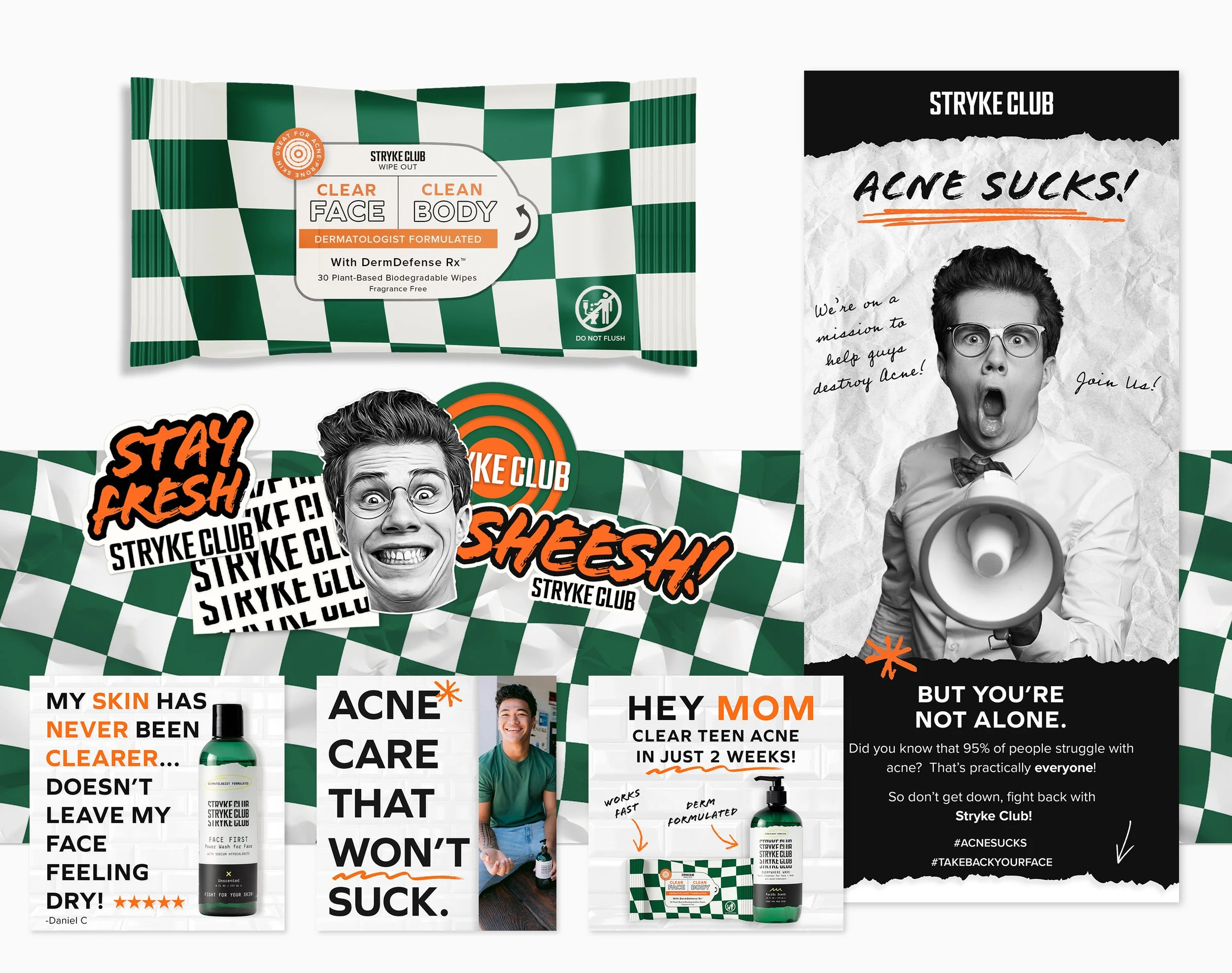
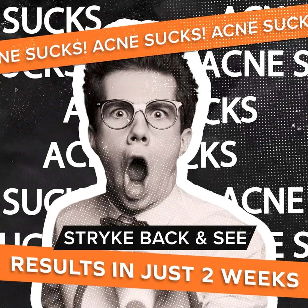
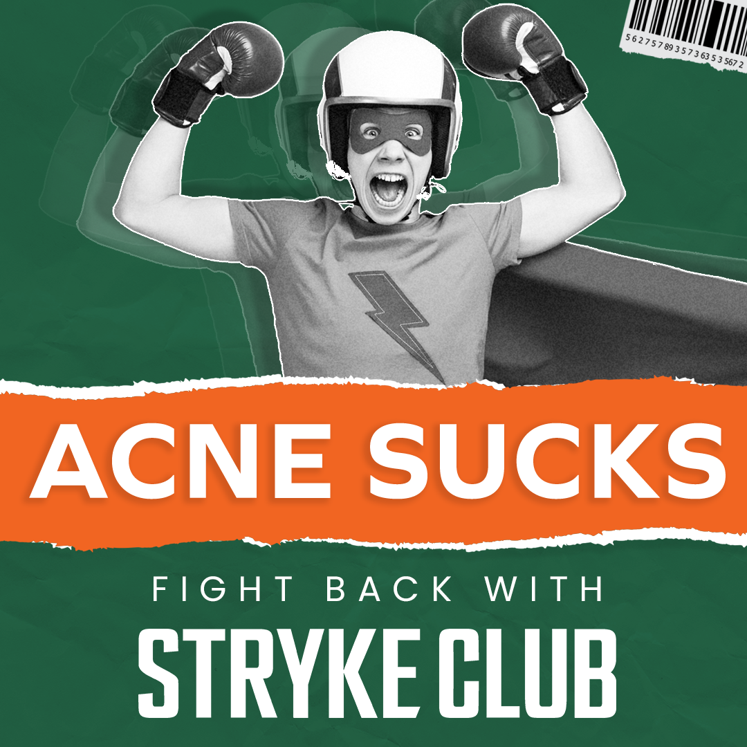
Meet The Champ: The Face That Made Acne Funny (and beatable)

When most skincare brands treat acne like a medical emergency, we went the opposite direction.
We created The Champ—a goofy, relatable and totally lovable character who became the unexpected hero of teen skincare.
He’s soft around the edges, wildly expressive, and always ready for battle—because beating acne shouldn’t feel like a science experiment. It should feel like victory.
Why We Made Him
Teen boys weren’t connecting with a faceless brand.
They didn’t want another clinical “solution,” and they definitely didn’t want to feel like a dermatology case study.
We needed a character who could bridge humor and heroism. Someone confident enough to fight acne in the open and funny enough to make you laugh about it.
The character needed to entertain teen boys without alienating moms.
That’s The Champ.
He Gives the Brand a Voice (and a wink)
The Champ can say things most corporate brands wouldn’t.
“Acne Sucks!”
“Pop pimples? Never. Pop off? Always.”
He lets us speak like teens actually speak—while keeping moms on board because the humor is always good-natured.
It’s the kind of comedy that unites, not divides.
He Gives the Brand Permission to Play
Skincare doesn’t have to whisper. The Champ shouts.
He memes, he cheers, he flexes—and in doing so, he turns the entire conversation around acne into something light, human, and shareable.
That humor gives us permission to push boundaries.
To say what every teen is already thinking, but no “brand” is bold enough to say… “F*CK ACNE”.
When The Champ speaks, we can be funny about the uncomfortable—and that’s where real connection happens.

He’s Instantly Recognizable
The Champ’s exaggerated shapes, playful proportions, and expressive face became our north star for visual identity.
His presence builds immediate recognition—a brand you can spot from across the room or in a crowded feed.
The Result
The Champ didn’t just represent the brand—he became it. It was a cultural permission slip to talk about the things that matter, but nobody likes to say out loud.
He gave us an emotional language that works across audiences—bridging the gap between teen humor and parental understanding:
Teens love him because he’s funny and confident.
Moms love him because he’s positive and protective.
He turned the brand from “just another skincare company” into a character-driven world where humor, confidence, and care coexist.
5X RoAS
The Champ campaign, led to a 5X RoAs compared to the previous top performing ad campaign.
Execution
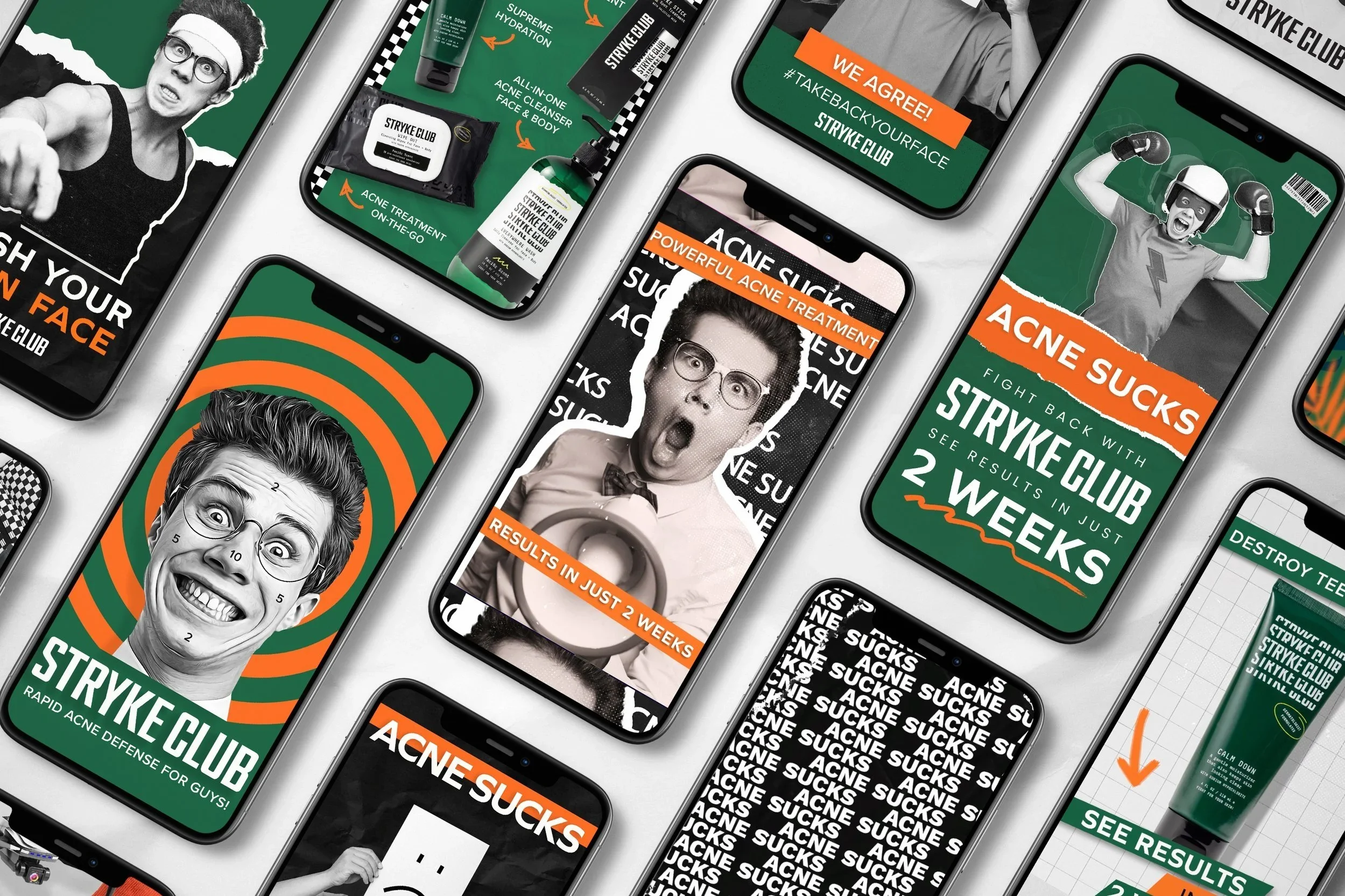
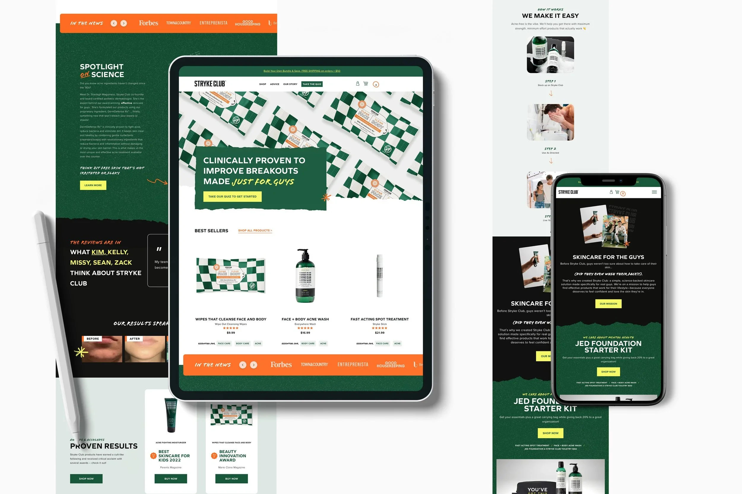
Digital Experience
We polished the brand site to speak to both audiences while pushing bold visuals.
For teens: Social proof, creator content, and humor-driven copy.
For parents: Ingredient transparency, medical credibility, testimonials.
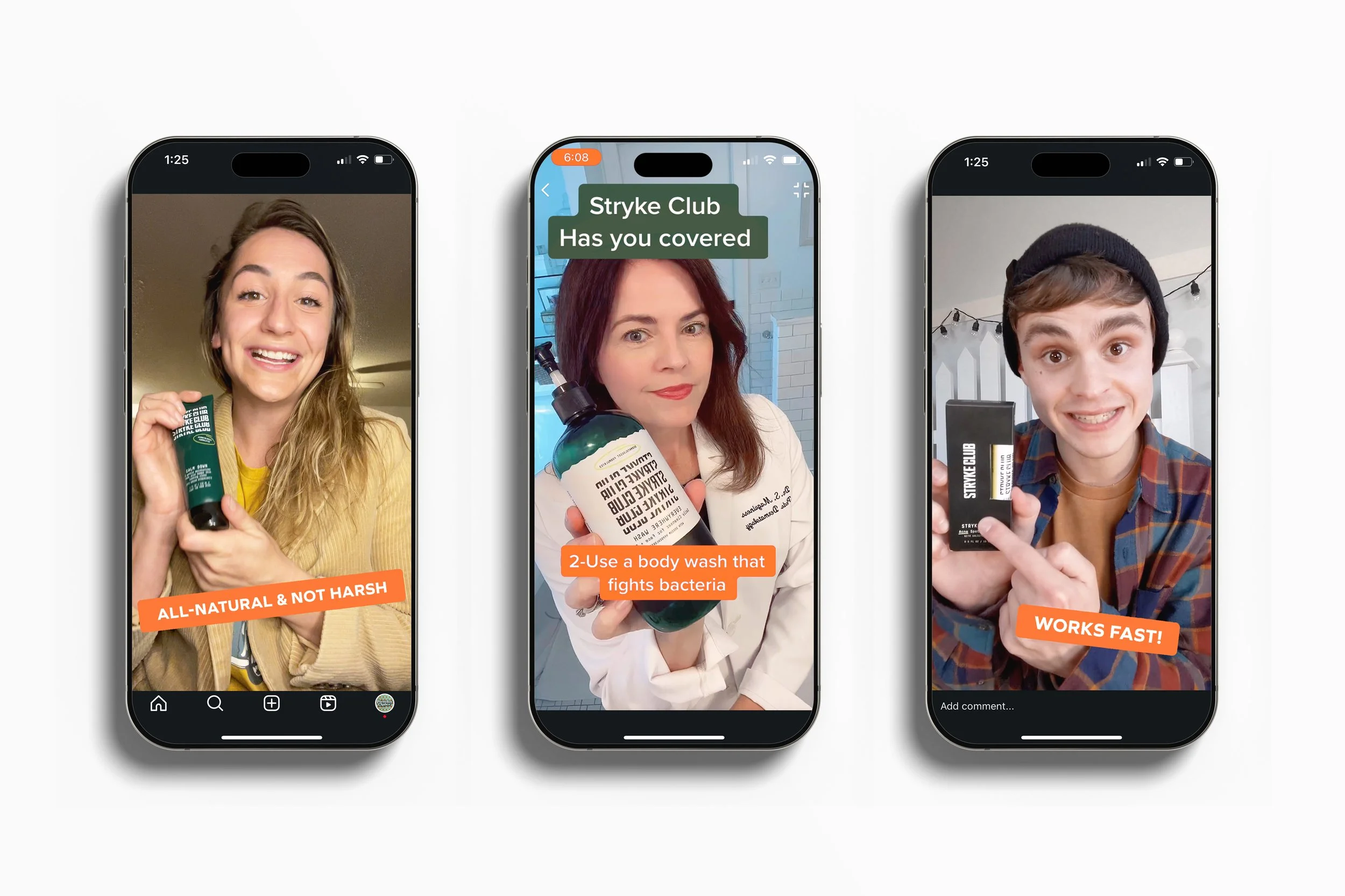
Social Media
We launched a two-track social campaign:
Teen Track: Focused on TikTok with creator-led humor, an influencer “Mythbusting” series and aspirational sports tie-ins using real teen teams.
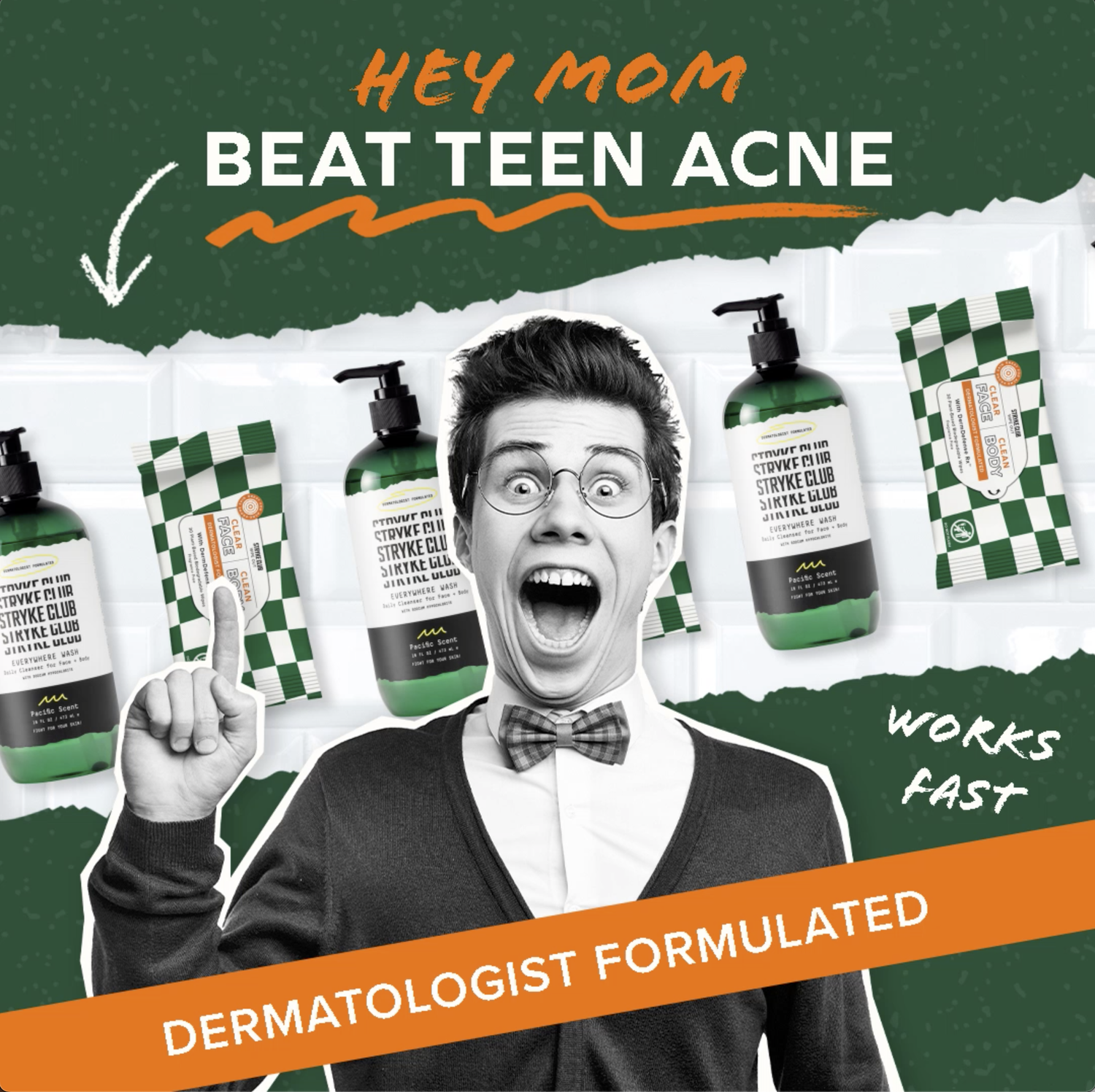
Parent Track: Facebook, Instagram, and Tik-Tok. “Mom-Approved” reviews and “Ask a dermatologist” series featuring co-founder Dr. Sheilagh Maguiness.
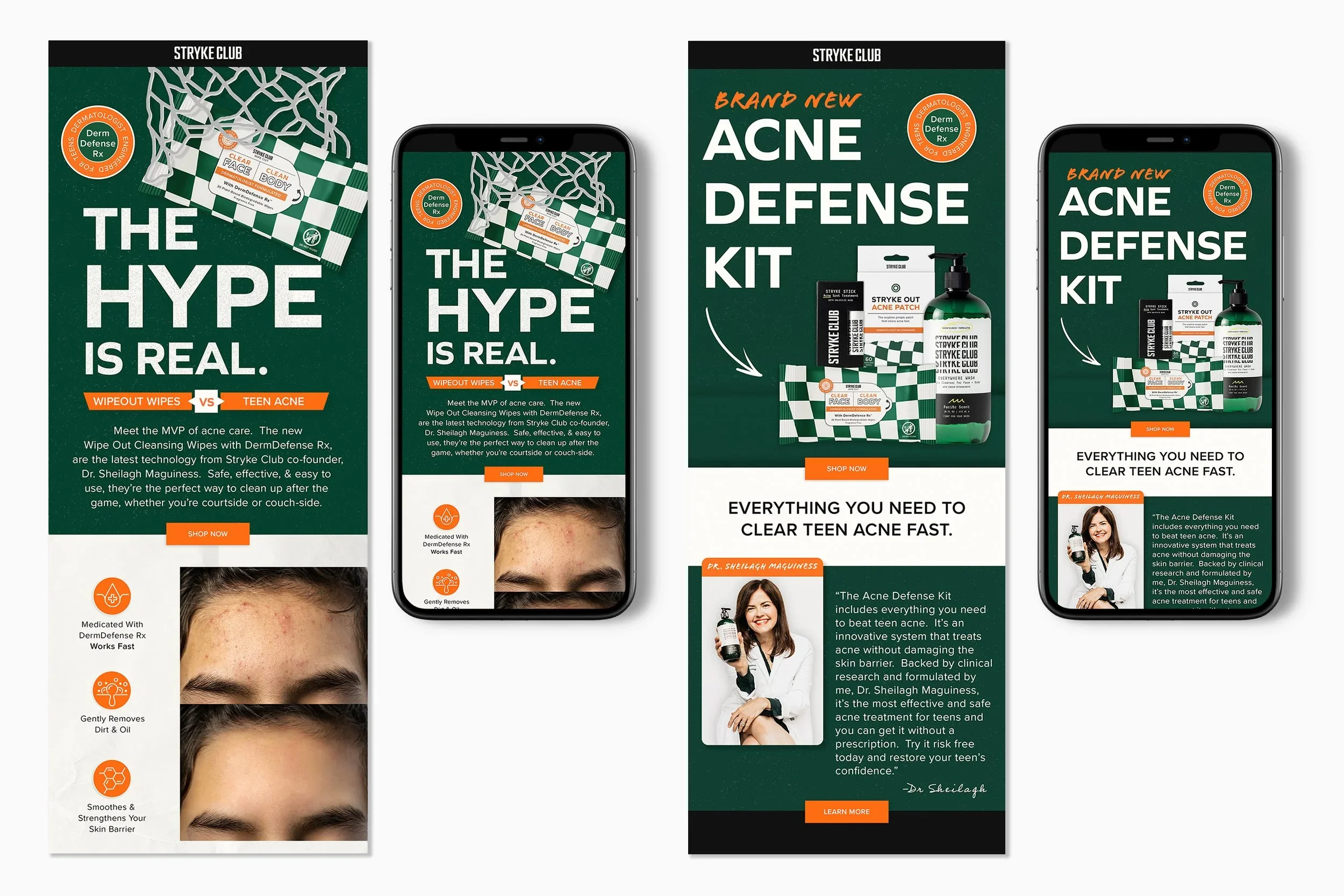
Email used to be our quiet, polite channel—a place for reminders, product tips, and polite “did you forget something?” messages. It was quite sterile.
But that tone didn’t fit who we’d become. It didn’t sound like The Champ.
So we rebuilt our email strategy from the ground up—blending The Champ’s blunt language, humor and teen first style with real results and dermatologist-backed science to create messages that people actually wanted to open.
“We didn’t just change the design of our e-mails. We changed the tone of the inbox.”
Forgettable to Unmissable: Redesigning the Package for Shelf Power
The original packaging was… fine.
It was a matte black box that disappeared on shelves faster than you could say dermatologist-approved.
It didn’t offend anyone—but it didn’t excite anyone, either. And when you’re talking to teen boys, “fine” is fatal.
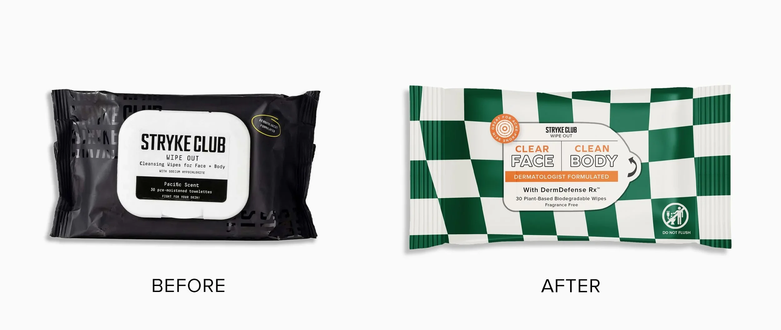
In order to stand out in crowded retail aisles, we rebuilt the package to command attention quickly.
Our guiding principles:
Be Seen from Across the Store.
We dialed up the color saturation, contrast. We replaced the flat black with bold, high-contrast color blocking—branded green and bright orange with confident typography layered over a matte finish.
Every inch of the design serves a purpose:
Large, legible type for easy scanning
Gloss highlights for light play under retail LEDs
The new packaging vibrates with kinetic color and confident shapes that pop against the sea of white and pastel competitors.
Be Instantly Recognizable.
The heart of the visual system is the checkerboard.
The bright orange draws attention to the most important aspect of our products “Dermatologist Formulated”.
Teens spot it instantly and moms see a trusted brand with personality, not attitude.
The Result
Packaging that looks less like skincare and more like gear.
On shelves, the brand no longer hides. It owns its space. Teens gravitate to it because it feels alive—confident, bold.
Parents trust it because it’s clean and well-designed, with clearly legible value.
Retailers started giving us more attention. The product went from just “another wash” to a brand with presence.