Milwaukee Low Life: Building A Cult Brand for Rebels
Contribution: Founder. Creative Director. Designer. Copywriter.

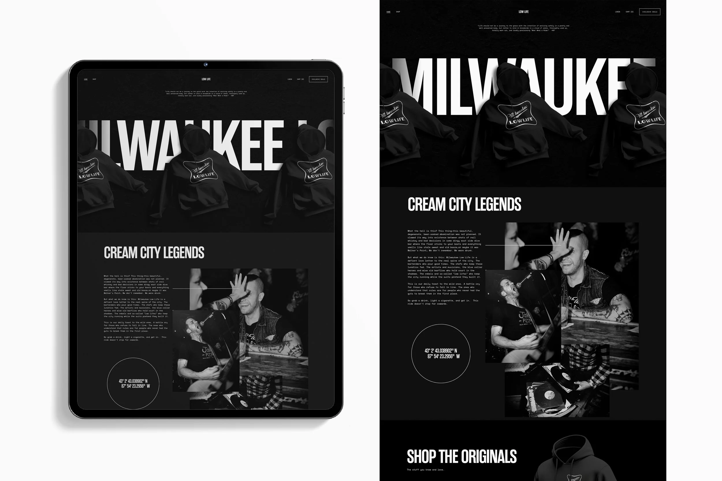
What the hell is this? This thing—this beautiful, degenerate, beer-soaked abomination was not planned. It clawed its way into existence between shots of rail whiskey and bad decisions in some dingy east side dive bar where the floor sticks to your boots and everything smells like stale sweat and old booze…or maybe it was Walker’s Point… we don’t remember. We were drunk.
But what we do know is this: Milwaukee Low Life is a defiant love letter to the real spine of the city. The bartenders who pour good times. The chefs who keep these lunatics fed. The artists and musicians, the blue collar heroes and wise old barflies who hold court in the shadows. The rebels and so-called “low lifes” who keep the city running while the suits pretend they built it.
This is our daily toast to the wild ones. A battle cry for those who refuse to fall in line. The ones who understand that rules are for people who never had the guts to break them in the first place.
So grab a drink, light a cigarette, and get in. This ride doesn’t stop for cowards.

Social Media
The main line is intentionally confined to black and white to establish a consistent, recognizable foundation, while giving a nod to the classic colors of rebellion—flyers stapled to light poles, photocopied zines, garage bands, patched jackets… you know the style.
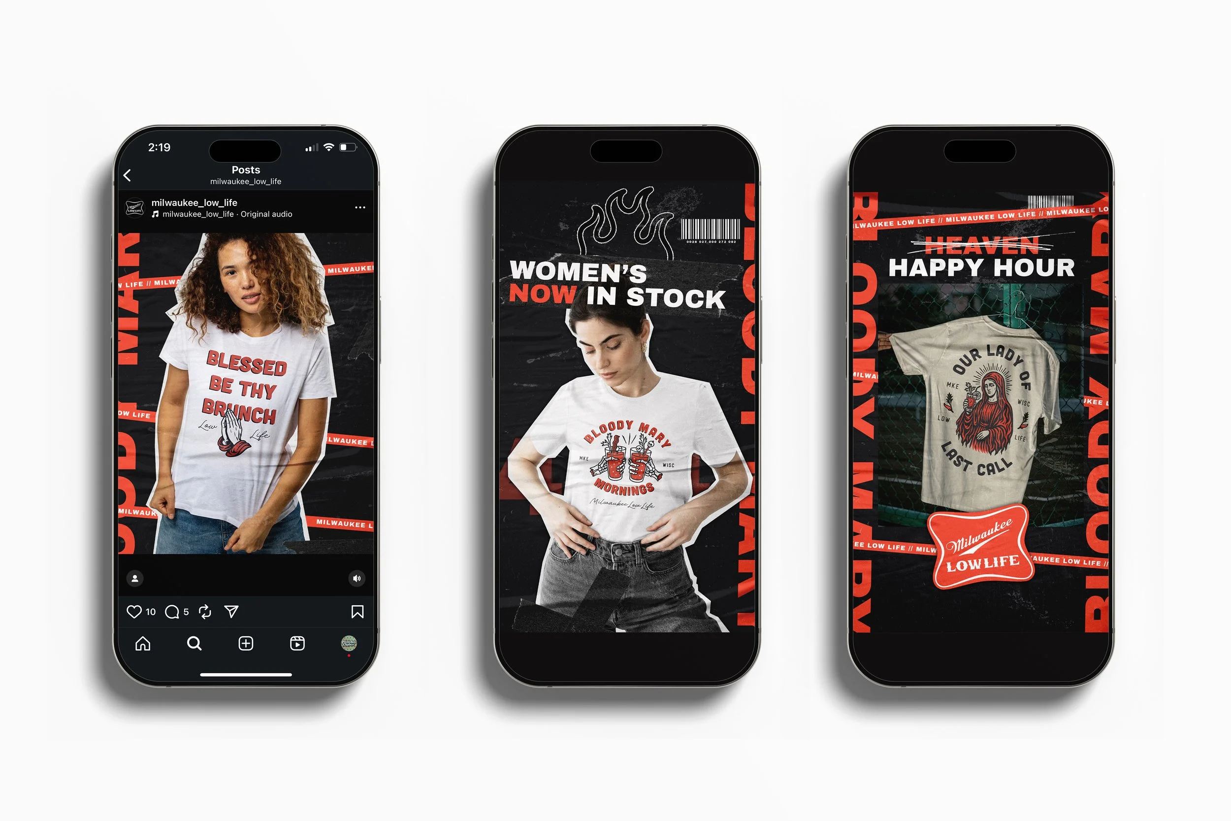
By withholding color until a limited capsule release, each introduction of color operates as a visual trigger—clearly distinguishing new drops, conveying scarcity, and driving focused attention without disrupting brand cohesion.
We carry the same limited palette across all consumer touch points. The consistent black-and-white baseline creates visual recognition in crowded social feeds. Introducing color only for capsules creates an intentional disruption that draws attention and increases engagement by leveraging contrast as a signal of novelty and scarcity.
Website
Bold Storytelling, Built on Milwaukee Grit. For Milwaukee Low Life, the website wasn’t designed to sell clothing — it was designed to tell stories that smell like spilled beer, neon lights, and bad decisions.
We built the experience around bold, unapologetic storytelling rooted in local culture, elevating Milwaukee not as a backdrop, but as the main character. The city’s dive bars, back alleys, last calls, and lifelong lowlifes became the narrative spine of the brand.
The design strips away distraction with a stark black-and-white system, channeling the rawness of underground zines, punk flyers, and outlaw journalism. This isn’t minimalism for luxury — it’s minimalism for impact. Every word, every image, every negative space choice forces the story to punch harder.
The traditional rebel palette — black, white, and the implied red of warning signs and liquor labels — frames the content like a manifesto instead of a catalog.
And layered through it all: a healthy dose of gonzo.
The copy doesn’t whisper. It rants. It drifts. It laughs at itself mid-sentence and then throws another punch.
Influenced by Hunter S. Thompson and barstool philosophers alike, the tone lives somewhere between poetic chaos and blue-collar truth. Stories aren’t polished — they’re lived. They blur the line between product, place, and persona.
Local stories became our currency:
Bartenders with thousand-yard stares
Musicians chasing noise in basements
Regulars who know the bartender’s dog’s name
Nights that never made it onto Instagram, and never should
By embedding these voices directly into the site, Milwaukee Low Life stopped feeling like a brand and started feeling like a movement wearing its own uniform.
The result is a website that doesn’t market rebellion — it documents it.
Not fashion.
Not lifestyle.
A living archive of low life, told loud, told honest, told Milwaukee.